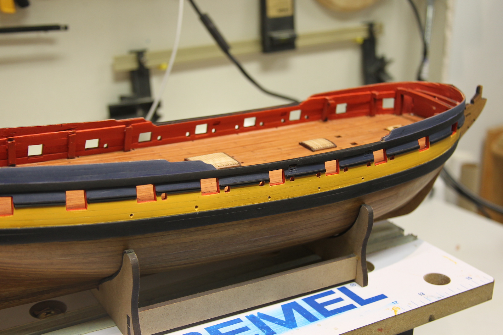
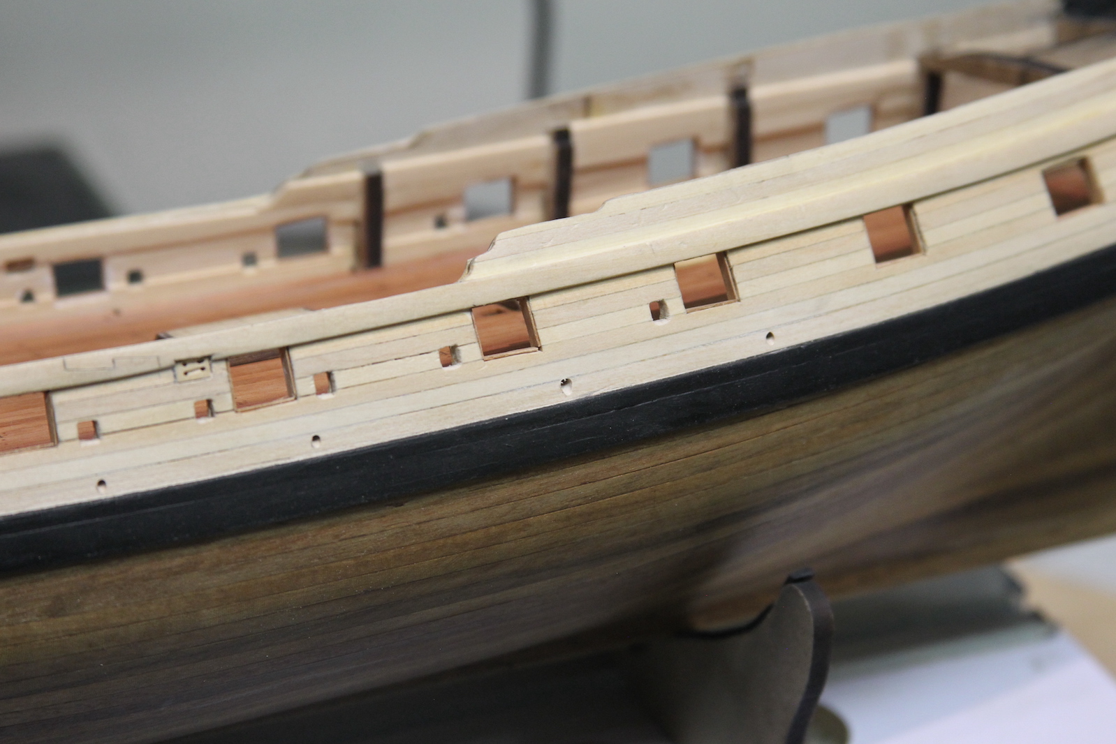
The scuppers on a ship are essentially the drain holes off the deck. Several holes line the outside of the waist of the main deck so when water gets on the deck is drains back out. They’re scaled out to be about 1.5 mm on the 1/64 Peg, with the exception of the scuppers that line up with the cisterns and the pump dales which are slightly larger.
This seems like a pretty straightforward part of the build – you just measure out the locations and drill the holes. Except for the fact that any time you drill holes there is exactly zero margin for error, and you have to get the angle perfect so the scupper hole goes from the black strake (remember it’s not actually black) up through to the deck – right where it meets the spirketting (the plank that runs along the base of the gun ports and joins the deck). It doesn’t really matter which way you drill I suppose, but I drill from the outside in – since the outside scuppers are much more visible and would be noticeable if they are not exactly in line.

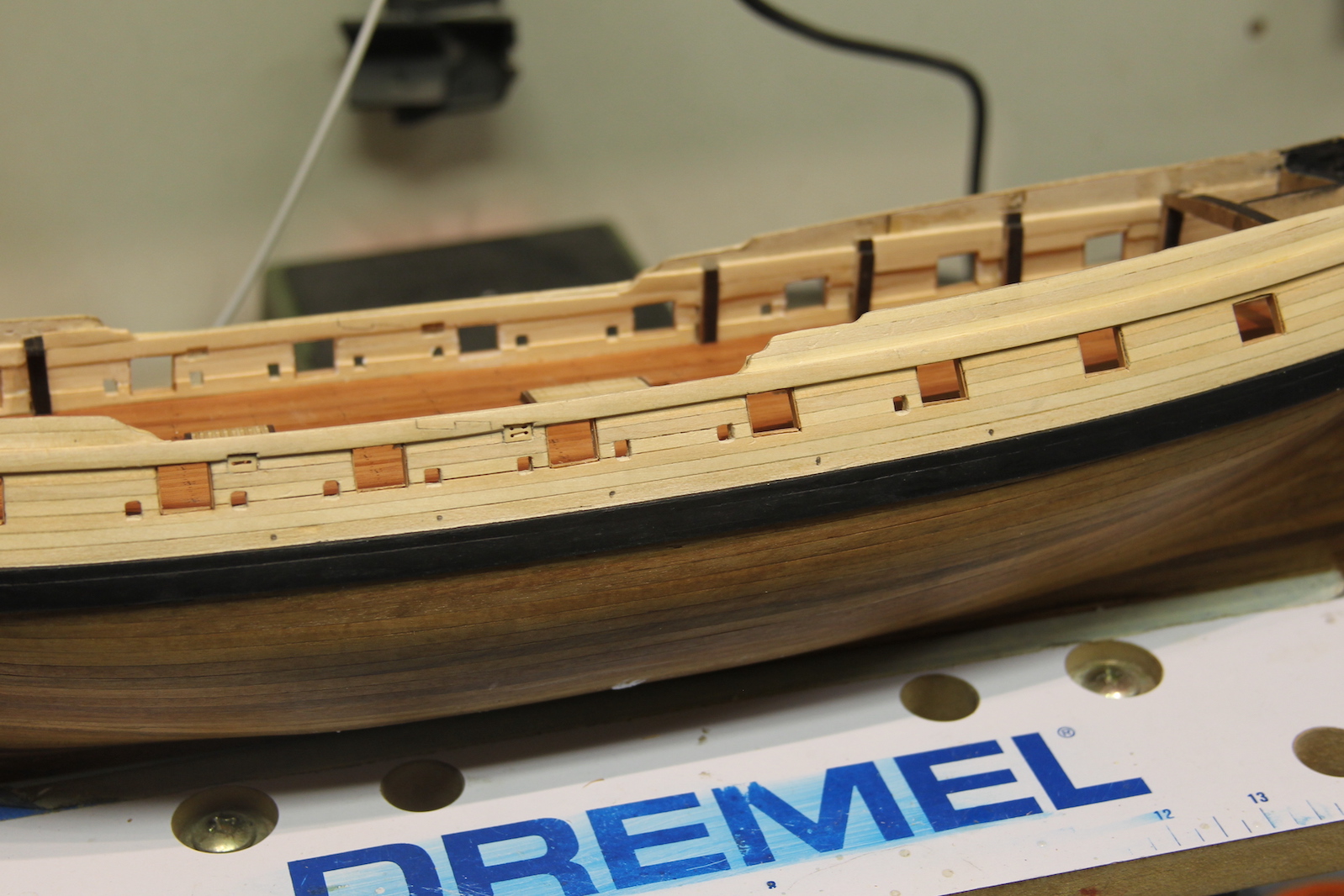
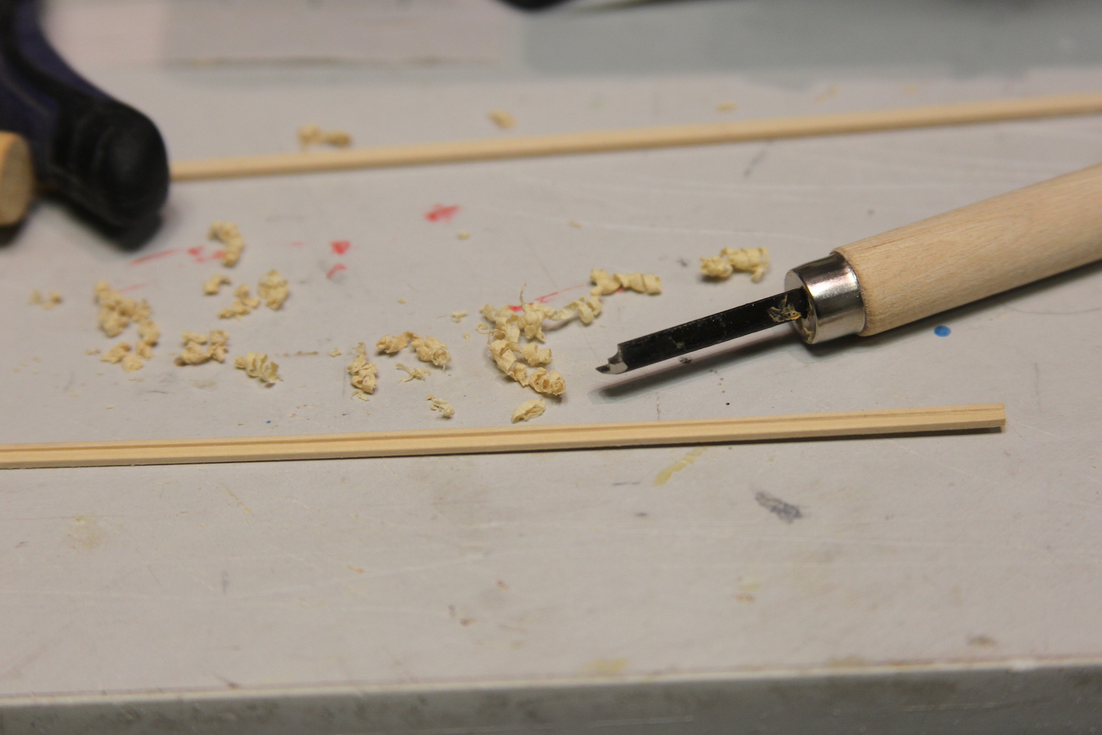
Next step is installing the rail along the outside of the gun ports that is part of the “stuff of the topside” or planking that makes up the outer gun ports. One of the key aspects of ship building is the need to devise your own tools and/or instruments for specific needs. In this case, I needed a way to scribe the rail to give it some texture, so I took a 90 degree chisel and notched out a groove so I could scrape along the strip.

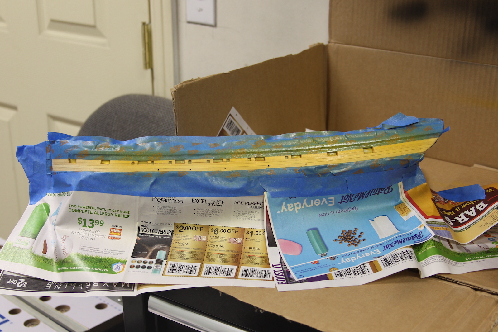
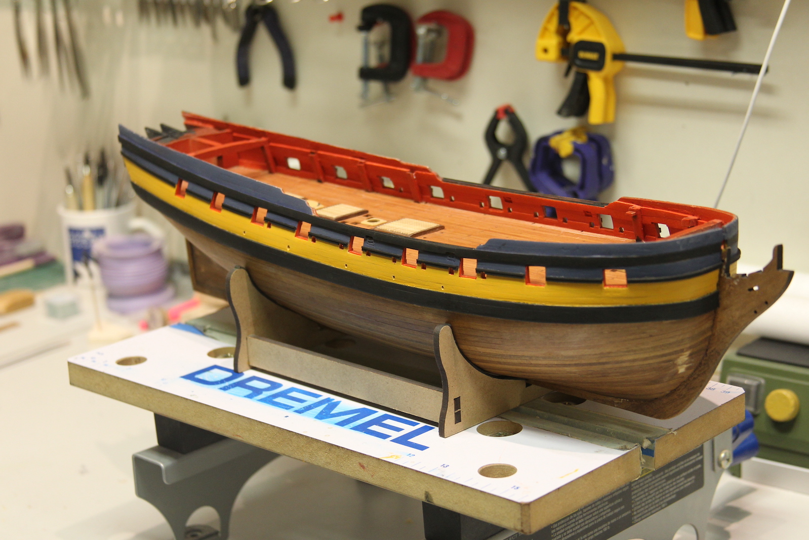
From there, it was on to painting. After quite a bit of research on the exact paint scheme of the Pegasus, I came up with ambiguous answers at best. There are definitely some consistencies in terms of how the ships were painted, but no definitive answer on this particular vessel that I could find. So, I used other Swan class and late 18th century British ships as a guideline and went with my own scheme. Yellow Ochre is pretty standard for the masts and other key parts – some of the ships left the gun ports natural, but most appeared to have those as yellow ochre as well. The inside of the gun ports was always red, but getting the shade is a little tricky – too bright and it looks weird, but too dull doesn’t stand out. I went with a Vermillion mixed with an earthy red ochre. Finally, the sides ranged from black to blue to natural, but I felt it needed to be something that would set off the frieze (the decorative bits that will eventually be added along the side of the ship) so I went with a blue gray.
My paint method involved masking each section off and laying down a few nice even light layers with an airbrush, then spending a good 8 to 10 hours going over each section to tighten up the lines and touch up any areas that needed attention.